

By
Mia Torres
Content Strategist, Foxy AI Academy
By Mia Torres, Content Strategist · Last updated May 2026 · 15 min read
Instagram changed its feed post dimensions in mid-2025, and most of the "ultimate guide" articles still showing up on Google haven't caught up. If you're sizing your posts to the old 1080x1080 default, you're getting cropped on the home feed and losing real estate where it counts. This is the complete 2026 guide, broken down by format, with the aspect ratios that actually display properly across Instagram in its current iteration.
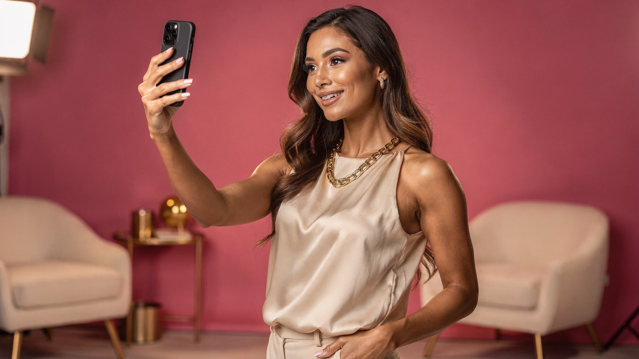
Want to skip the resizing headache entirely? Foxy AI generates Instagram-ready photos and videos of you at any aspect ratio. No cropping, no rescaling. Build your AI twin →
What you'll learn
The quick answer (save this table)
Why post size still matters in 2026
Instagram feed post sizes in detail
Size strategy by creator type
Instagram Stories: 1080 x 1920
Instagram Reels: 1080 x 1920 (with a catch)
Instagram carousel posts
Instagram aspect ratios at a glance
Best tools by format
How to actually create content at the right size
Common mistakes to avoid
The 10-minute Instagram audit
What's coming next
Frequently asked questions
The quick answer (save this table)
If you only need the numbers, here they are:
Format | Size (px) | Aspect ratio | Notes |
|---|---|---|---|
Feed post (portrait, current default) | 1080 x 1350 | 4:5 | The new standard since mid-2025 |
Feed post (square, legacy) | 1080 x 1080 | 1:1 | Still supported, but takes less feed space |
Feed post (landscape) | 1080 x 566 | 1.91:1 | Smallest footprint, rarely worth it |
Carousel slide | 1080 x 1350 | 4:5 | Match across all slides |
Reel | 1080 x 1920 | 9:16 | Same as Stories |
Reel cover | 1080 x 1920 | 9:16 | Plus a center-safe zone for the grid crop |
Story | 1080 x 1920 | 9:16 | Full-screen vertical |
Profile photo | 320 x 320 (displayed) | 1:1 | Upload at 1080 x 1080 for retina |
IGTV cover | 420 x 654 | 1:1.55 | Vertical preview |
Key takeaways
Switch every feed post to 4:5 portrait (1080 x 1350). It's the 2026 default and claims roughly 25% more feed space than square.
Stories and Reels are both 9:16 at 1080 x 1920. Keep your subject centered.
Carousels: lock every slide to one ratio. Slide 1 sets it for all 10.
The cheapest engagement win available is creating at the right ratio from the start instead of recropping later.
Bookmark that and you can skip ahead. But if you're trying to actually win on Instagram in 2026, the numbers are only half the story.
Why post size still matters in 2026
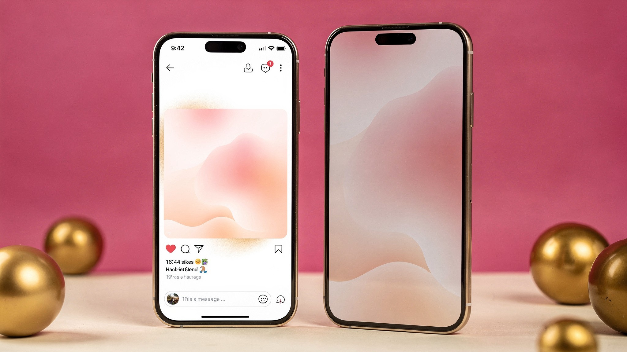
Left: a 1:1 square post. Right: a 4:5 portrait post at 1080 x 1350. The portrait version claims noticeably more feed space on the same screen.
Instagram is a visual feed where every pixel of your post fights for attention. The home feed is now portrait-first, which means a square post takes up roughly 25% less screen real estate than a 4:5 portrait. That's 25% less stopping power per scroll. Multiply that across thousands of impressions and you can see why creators who switched to portrait in 2025 saw their engagement creep up without changing anything else.
There's also the algorithm angle. Instagram has been pretty clear that completion rate (how long someone looks at your post) is a ranking signal. Bigger posts hold the screen longer. Bigger posts get more dwell. More dwell tells the algorithm "show this to more people." It's a loop, and getting the size right is the cheapest input you can fix today.
Then there's the production side. If you're cranking out content week after week, having one source file at the right ratio means you stop wasting time recropping for each placement. Tools that build content at the correct ratio from the start (like Foxy's AI twin feature) are designed around this. Generate once at 4:5, push to feed, and you're done.
This becomes especially important once you're posting across multiple formats. If you're publishing five times a week and pushing each post to feed, Stories, and Reels, that's 15 placements per week. At two minutes of resizing per placement, that's a full hour of busywork that could be spent on creative.
Instagram feed post sizes in detail
Portrait 4:5 is the 2026 feed default. Design for 1080 x 1350 and you stop fighting Instagram's crop.
The feed is where most creators still spend most of their effort, so let's go deep here. These are the dimensions Instagram itself documents in its official Help Center, updated for the current app.
Portrait (1080 x 1350) - the new default
This is what Instagram now treats as standard. A 4:5 ratio gives you the maximum vertical footprint allowed in feed without overflowing into the next post. If you only adopt one change this year, it's switching every feed post to 1080 x 1350.
When you design at this ratio, keep these in mind:
The bottom 20% of the image is partially obscured by the action buttons and caption preview on mobile. Don't put critical text or faces there.
Center your subject in the top two-thirds.
Faces should be roughly 30-40% of the frame for portrait shots that perform well in the algorithm. Too tight feels invasive, too loose loses the connection.
Pro tip: Instagram's in-app crop preview is more honest than it used to be, but still check every post before publishing. What looks centered in your editing tool can sit 30 pixels too low once Instagram applies its own crop.
Square (1080 x 1080) - the legacy classic
Square still works, especially if your grid is a key part of your brand. Think tightly curated feeds where the grid view matters more than the home feed. The trade-off is real estate: a square loses out in the home feed but wins in the grid.
If your audience finds you via the grid (profile views, link in bio, brand partnerships looking at your feed), square is still fine. If your audience finds you via the home feed and Explore (most creators), switch to portrait.
Landscape (1080 x 566) - skip it
There's almost no good reason to post landscape on Instagram in 2026. It takes the smallest screen footprint, gets the lowest engagement, and signals "this was made for somewhere else first." If you have horizontal content (a wide shot, a panoramic), turn it into a carousel where each slide is portrait. You'll keep the visual impact and stop hemorrhaging engagement.
Size strategy by creator type
Different content categories have different sizing playbooks. Here's the cheat sheet for the most common creator types:
Fashion creators
Fashion content lives or dies on the outfit. 4:5 portrait gives you the head-to-toe frame your audience wants.
Outfit reveals: 4:5 portrait, full body or three-quarter framing
Detailed look breakdowns: carousels at 4:5 portrait
Transitions and OOTDs: Reels at 9:16, subject centered
Why: vertical formats showcase outfits head-to-toe, which is what your audience wants to see
Fitness creators
Movement reads best vertical. Shoot fitness demos in 9:16, posed physique shots in 4:5.
Form and demo content: 9:16 vertical Reels at 1080 x 1920
Transformation shots: 4:5 portrait for before/after side-by-side
Workout flows: 9:16 for movement, 4:5 for posed physique shots
Why: bodies in motion read better vertical, posed physique reads better in 4:5
Food and lifestyle creators
Food benefits from negative space. 4:5 portrait gives you room above and below the dish.
Plated shots: 4:5 portrait for hero, 1:1 for grid aesthetic
Recipe walkthroughs: 9:16 Reels for technique
Ingredient flat lays: 1:1 or 4:5 depending on grid strategy
Why: food benefits from negative space, which 4:5 gives you above and below the dish
Beauty creators
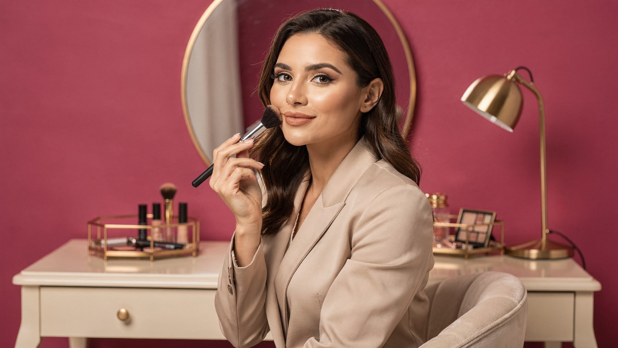
Skin and detail need pixels. Shoot beauty content in 4:5 over 1:1 whenever you can.
Before and after: 4:5 portrait for side-by-side, or a carousel split
Application tutorials: 9:16 vertical Reels at 1080 x 1920
Product flat lays: 1:1 square works well for brand-deal content
Why: skin and detail benefit from larger pixel space (4:5 over 1:1)
Travel creators
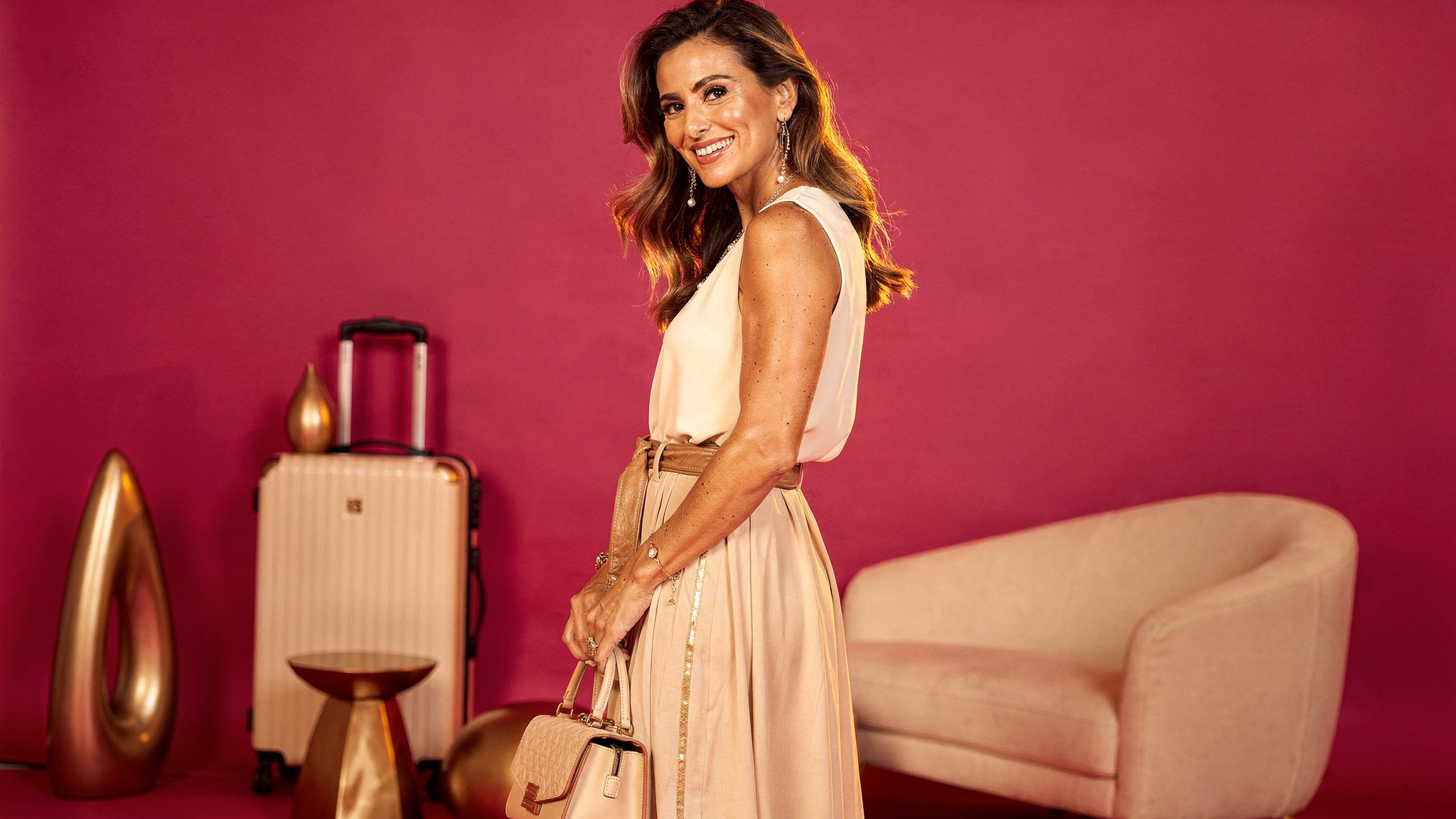
Travel content is all visual impact. 4:5 gives the location maximum vertical real estate.
Scenic and portrait shots: 4:5 to give the location vertical real estate
Panoramic landscapes: split across a carousel of 4:5 portraits, slide-by-slide
Movement and reels: 9:16 vertical
Why: travel content lives or dies on visual impact, and 4:5 maximizes that
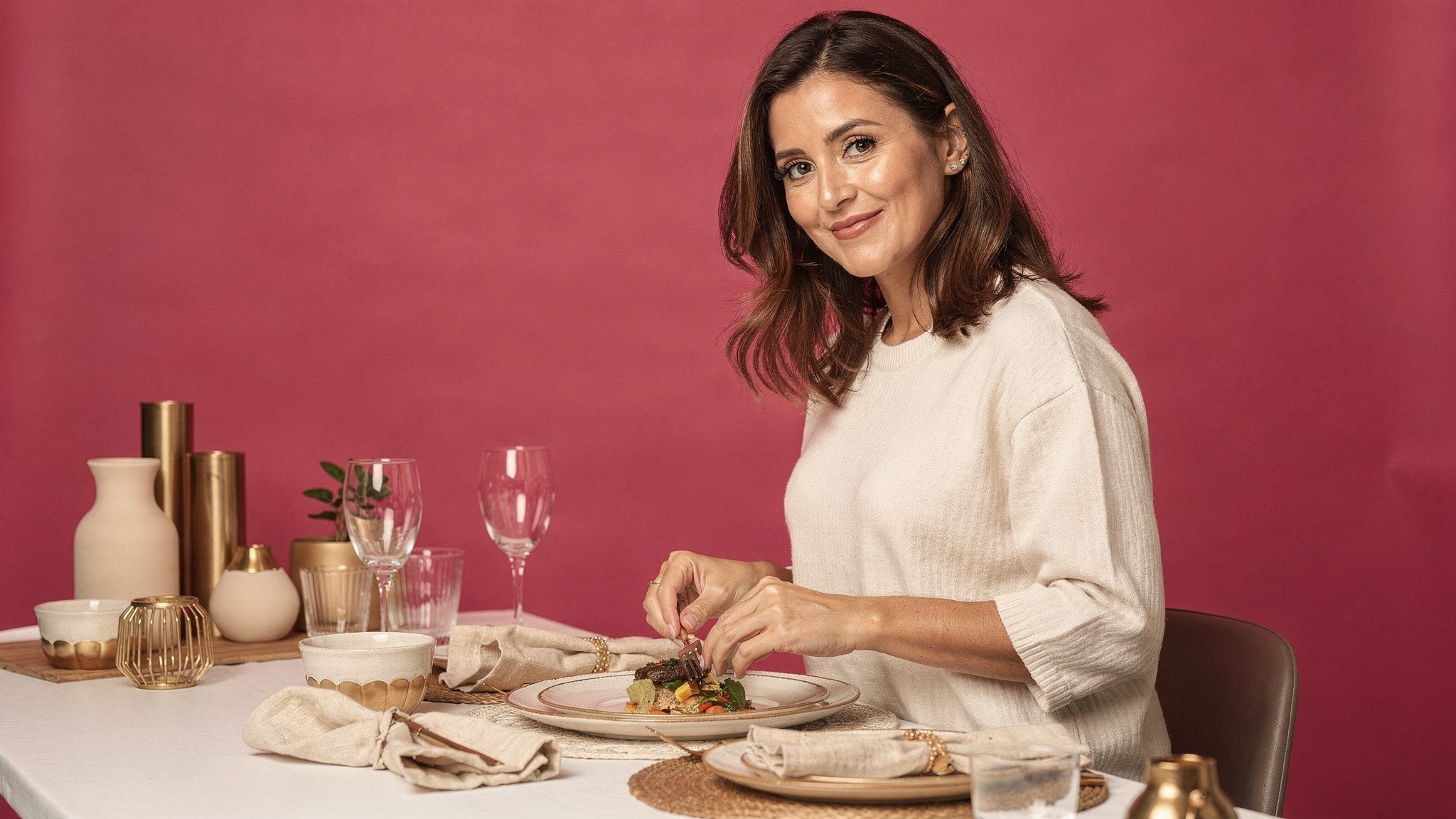
AI influencer builders
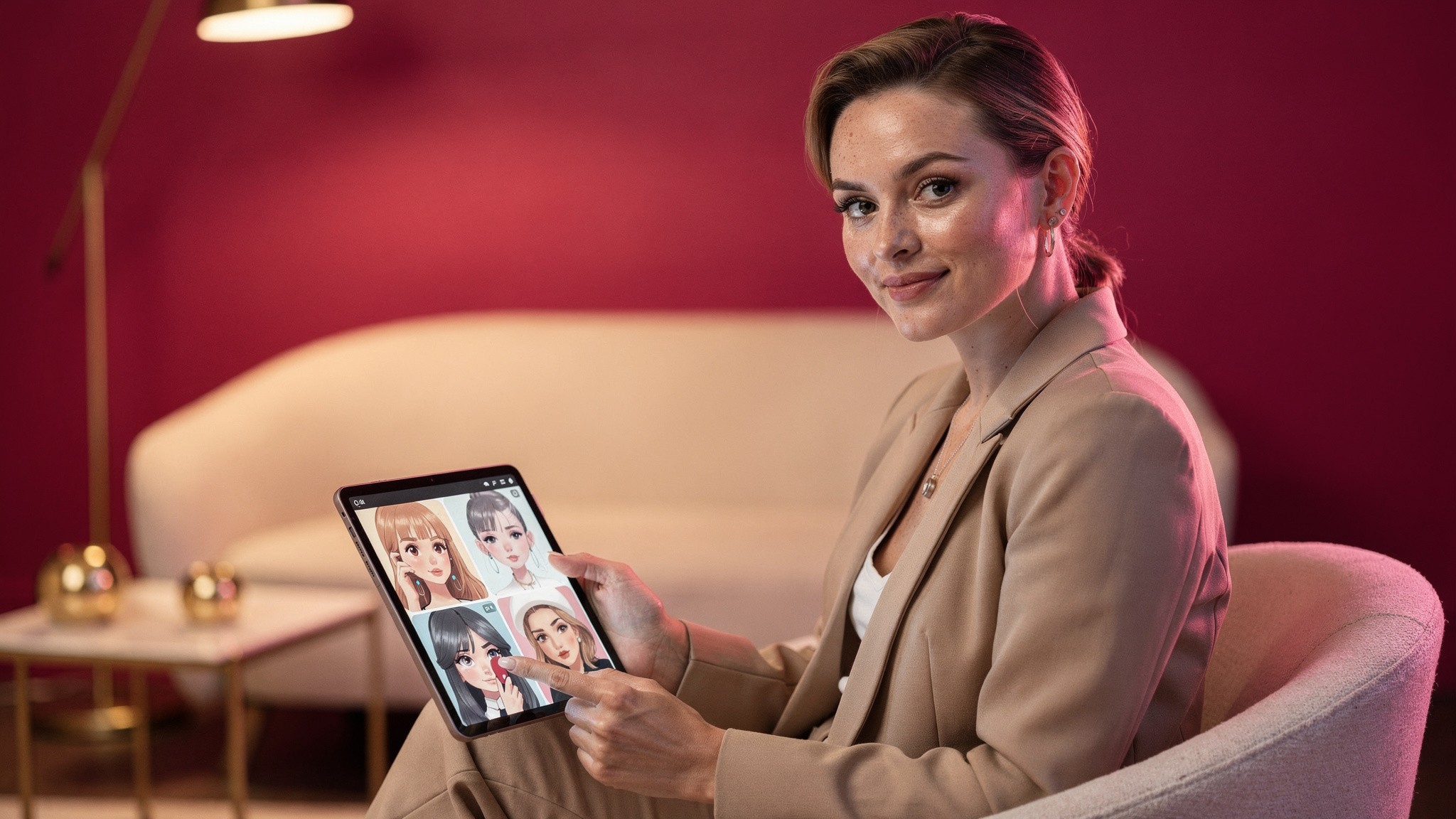
Building an AI influencer? Generate your character at 4:5 as the master format, then adapt to other ratios.
If you're building an AI influencer on Fanvue, IG, or similar, you have the same sizing rules as any other creator, with one key difference: consistency of likeness across every post matters more than for a human creator. Generate your AI character at 4:5 portrait as the master format, then crop or regenerate to 9:16 for Reels and 1:1 if your grid demands it. Maintaining a recognizable face across hundreds of posts is what builds the audience.
Instagram Stories: 1080 x 1920
Instagram Stories run 9:16 at 1080 x 1920. Keep faces and text inside the middle 1420 pixels.
Stories are the simplest format because they're always 9:16 full-screen vertical. Use 1080 x 1920 at minimum. Higher is fine, Instagram will downsample.
A few rules that matter:
The top 250 pixels and bottom 250 pixels are partially covered by your username and the reply bar. Keep important text and faces in the middle 1420 pixels.
Save your file at 72 DPI - higher DPI doesn't improve quality and may slow upload.
For Story templates and graphics, design in the 1080 x 1920 canvas from the start. Resizing from a square crops poorly and loses fidelity.
If you're using stickers, polls, or interactive elements, leave more room. Those native widgets need real estate.
Pro tip: Build a reusable 1080 x 1920 Story template with the top 250 and bottom 250 pixels marked off as no-go zones. You'll never lose a headline behind the username bar again.
Instagram Reels: 1080 x 1920 (with a catch)
Center your subject vertically. Reels get cropped to a 1:1 square in the grid preview.
Reels share the Story dimensions but have a key gotcha: when a Reel appears on your feed grid, it gets cropped to a 1:1 square preview. So if your subject is dead center vertically, you're fine. If your subject is at the top or bottom of the frame, the grid preview cuts them off. (For the full breakdown on how long Reels can be and what performs best, see our Reel length guide.)
Best practice for Reels:
Shoot or generate in 9:16 (1080 x 1920) at minimum.
Keep your subject in the center 60% of the vertical frame.
Design Reel covers separately if you want different grid art vs the in-Reel hook. Instagram lets you upload a custom cover.
Avoid burning text overlays into the top 250 pixels or bottom 350 pixels of the frame, where the username and caption sit.
If you're using AI to generate your Reel content (think a fashion creator making outfit transitions or a fitness creator making demo loops), generate at 1080 x 1920 from the start. Tools like Foxy's AI video generation let you set output dimensions, so you're never stuck rescaling after the fact.
Instagram carousel posts
Carousels reward consistency. Lock every slide to the same 4:5 ratio at 1080 x 1350.
Carousels are the secret weapon of the 2026 algorithm. They hold attention longer than single posts because viewers swipe through, which Instagram counts as engagement. Our step-by-step carousel guide goes into the full workflow.
The sizing rules:
Every slide should be the same aspect ratio. Most creators choose 4:5 portrait (1080 x 1350) to match the new feed default.
The first slide's aspect ratio sets the ratio for the rest. Instagram crops subsequent slides to match.
Maximum 10 slides per carousel.
Design tip: build your slides as one continuous strip in a design tool, then slice them into 10 separate files. Hand-off feels seamless when the visual flows from slide to slide. Bonus points if slide 1 has a clear hook like "swipe →" because Instagram only rewards swipes if they happen.
Quick carousel checklist
Slide 1 hooks (curiosity, contrast, bold claim)
All slides at 1080 x 1350
Each slide makes one point
Final slide has a CTA (save, share, follow, comment)
Consistent color and style across all 10 slides
First and last slides should work as standalones (in case people don't swipe)
Instagram aspect ratios at a glance
Instagram supports four aspect ratios. Designing inside 1:1, 4:5, 1.91:1, or 9:16 avoids the auto-crop.
If sizes are the "exactly which pixels" answer, aspect ratios are the "what shape" answer. Here are the ones Instagram supports:
Aspect ratio | Use case | Min/max width |
|---|---|---|
1:1 | Square feed posts, profile photos | 320 - 1080 px |
4:5 | Portrait feed posts (current default) | 320 - 1080 px |
1.91:1 | Landscape feed (legacy) | 600 px min |
9:16 | Stories, Reels, full-screen vertical | 1080 - 1920 px |
Instagram will display anything in between these as well, but it'll crop to fit one of these ratios. Designing in the supported ratios from the start avoids any unwanted cropping. Instagram's Help Center lists the accepted aspect ratio ranges if you want the source.
If you want a deeper dive on which ratio works best where, our complete Instagram aspect ratio guide covers ratios for every placement including IGTV, Shopping, and Live.
Best tools by format
The right tool depends on what you're producing. Here's the honest landscape:
Tool | Best for | Free tier? | How it fits with Foxy |
|---|---|---|---|
Templates, design from scratch, social graphics | Yes, with limits | Generate your content with Foxy; design layouts and overlays in Canva | |
Quick resizing of existing assets, social-ready exports | Yes, with limits | Foxy outputs at exact ratios so no resizing needed; Express is helpful for finishing touches | |
Mobile video editing, Reel polish | Yes, with watermark | Foxy generates AI Reels; InShot edits and adds music | |
Mobile and desktop video editing | Yes, full features | Same combo with Foxy generation | |
Browser-based video editor, auto-subtitle | Yes, with limits | Same combo with Foxy | |
Foxy AI | AI-generated photos and videos of you at any size | Paid (from $29/mo, less on annual) | This is the new layer in the stack: generate the asset itself |
Foxy sits one layer up from the design tools. Canva and Adobe Express are great for arranging content. Foxy is for generating the content in the first place. If you're seeing the same trio of creator photos repeat across your feed, Foxy is what fixes that variety problem.
For a deeper landscape look across the AI tooling category, see our best AI tools for influencers in 2026 roundup.
How to actually create content at the right size
Generating content at the target ratio from the start beats cropping one shoot a dozen different ways.
Knowing the sizes is one thing. Producing content at those sizes, consistently, across hundreds of posts, is the actual problem.
Three approaches that work for creators in 2026:
1. Shoot for the largest needed format first
If you'll be cutting one shoot into feed, Stories, and Reels, shoot vertically at 1080 x 1920 or higher and crop down. Going from 9:16 to 4:5 to 1:1 is easy. Going from 1:1 up to 9:16 means stretching or filling, which always looks worse.
2. Use AI generation to skip resizing entirely
This is where AI content tools change the workflow. Instead of one shoot and a dozen crops, you generate the asset you need at the ratio you need. Need a feed post at 4:5? Generate at 1080 x 1350. Need a Reel cover at 9:16? Generate at 1080 x 1920. No cropping, no rescaling, no compromise.
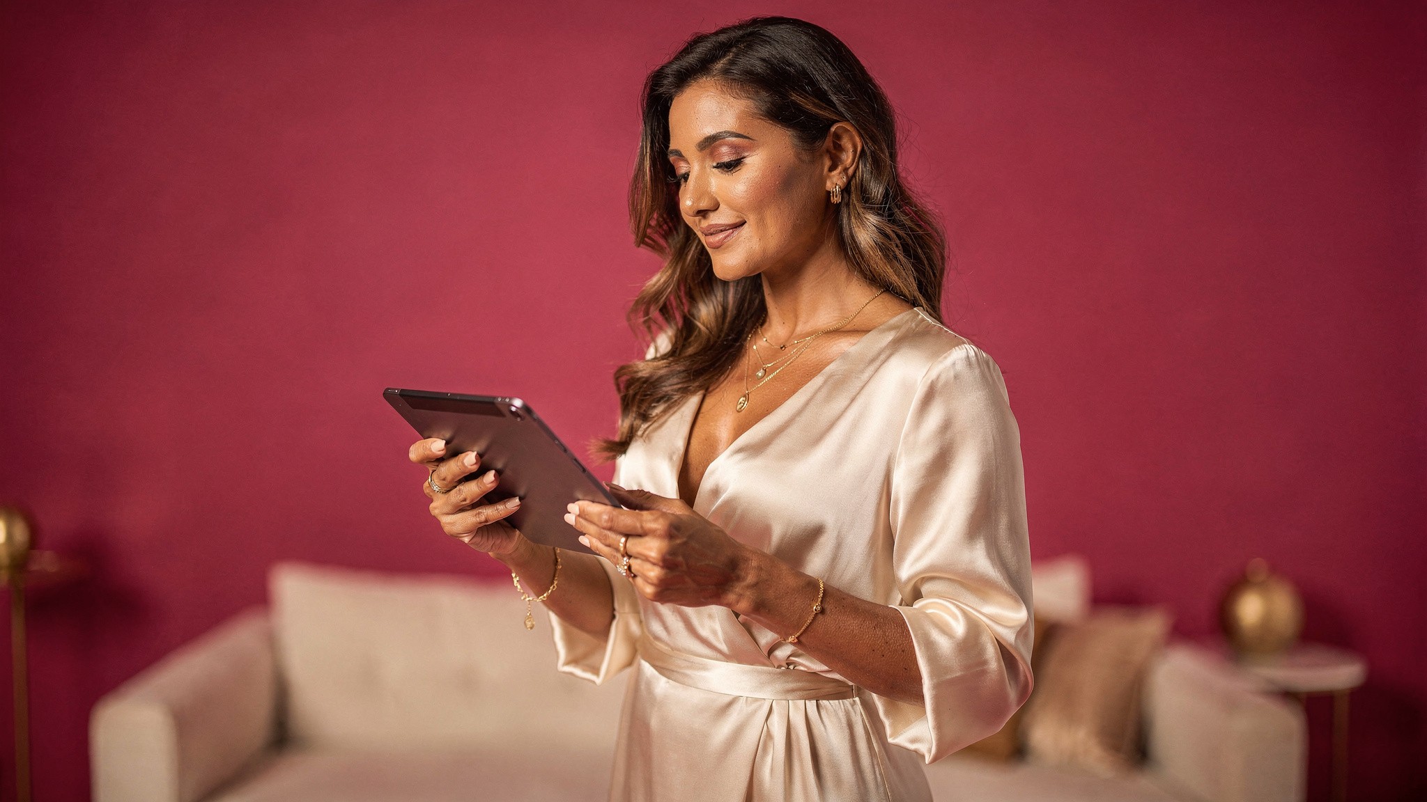
Foxy's AI twin feature handles this directly. You upload a few photos, Foxy builds your AI twin, and from there you generate as many ultra-realistic AI images and AI videos at whatever ratio you need. It's built to cut down on expensive, time-consuming shoots - more content for less work.
Generate Instagram-ready content of yourself at any aspect ratio. Foxy creates ultra-realistic photos and videos at 4:5, 9:16, 1:1 or any custom dimension you need, all from one AI twin.
Get started with Foxy →
3. Templatize your dimensions
If you're sticking with traditional shoots, build a template library at the standard sizes. One template for feed posts, one for carousels, one for Stories, one for Reel covers. Drop new assets in, export, done. Every minute you save on resizing is a minute you can spend on actual creative.
Common mistakes to avoid
For portrait feed posts, faces that fill 30-40% of the frame tend to perform best.
Even creators who know the sizes still trip on these.
Posting at 1080 x 1080 in 2026. It's not wrong, but it's a missed opportunity. The grid view doesn't care, but the home feed does.
Designing Stories at the wrong vertical space. Critical info gets covered by the username and reply bar.
Mixing aspect ratios in a carousel. Slide 1 sets the ratio. Slides 2-10 get cropped to match. Plan ahead.
Saving at low quality. Use Save for Web at 80 to 100% JPG quality, or PNG for graphics with text. Anything lower looks bad after Instagram's own compression hits.
Forgetting the Reel grid crop. Subject at the top or bottom of a 9:16 Reel disappears in the grid preview. Center your subject.
Ignoring profile photo upload size. Upload at 1080 x 1080 minimum even though it displays at 320 x 320. Retina screens make low-res profile photos look fuzzy.
Burning hashtags into the image. Counts against your visual real estate and doesn't help SEO. Put your hashtags in the caption where Instagram can read them properly.
Forgetting to optimize Reel covers separately. A Reel cover is your grid art, not the same as the in-Reel hook. Different placement, different size, different design considerations.
Pro tip: If you only fix one thing on this list, fix the square-versus-portrait default. It's the single change that moves engagement the most for the least effort.
The 10-minute Instagram audit
A 10-minute audit of your last 90 days of posts will tell you exactly what to fix first.
If you've been posting at the old sizes, here's the fastest fix:
Open your three best-performing posts from the last 90 days.
Note the size (Instagram shows ratio in the post metadata if you tap into post insights).
If any of them are 1:1 square, your next 10 posts should be 4:5 portrait. Compare engagement.
For your Story templates, re-export at 1080 x 1920 if they're not already.
For Reels, scrub the last 5 you posted. Are subjects centered vertically? If not, fix the framing on your next 5.
Check your profile photo. If it was uploaded years ago, it might be below 1080 x 1080. Re-upload a sharp version.
You don't need to rewrite your whole content system. Just shift the dimensions on what you make going forward. Combined with the right follower-growth strategy and consistency, this single change tends to compound fast.
What's coming next
Instagram is testing 9:16 feed posts. Designing at 4:5 today keeps you ready for whatever lands next.
Instagram has been testing 9:16 feed posts in some markets, which would unify Reels and feed into one vertical format. If that rolls out widely (we're watching it through 2026), the move toward portrait will go even further. Designing at 4:5 today positions you well for whatever ratio Instagram lands on next, while square posts will get less and less relevant.
For creators who want to stay ahead of these shifts, the answer is to decouple your content creation from any single ratio. AI-generated content with adjustable output ratios is the only system that ages well as Instagram keeps changing the rules.
Related guides from the Foxy Academy
Frequently asked questions
What is the best Instagram post size in 2026?
The best size depends on the format. For feed posts, use 1080 x 1350 pixels (4:5 portrait) as the new default. For Stories and Reels, use 1080 x 1920 (9:16 vertical). Profile photos should be uploaded at 1080 x 1080 even though they display at 320 x 320, so they stay sharp on retina screens.
Should I post square or portrait images on Instagram?
Portrait (4:5) in almost every case. The home feed favors portrait posts because they take up more vertical screen space, which translates to longer dwell time and better algorithmic distribution. Square (1:1) only makes sense if your audience finds you primarily through your grid, which is rare in 2026.
Why is my Instagram post getting cropped?
Three common reasons: you uploaded a non-supported aspect ratio (Instagram will auto-crop to the nearest supported ratio), your image is wider or taller than the max ratios (1.91:1 wide or 4:5 tall for feed), or you're mixing ratios in a carousel (slide 1 sets the ratio for all slides). Stick to supported ratios and you avoid all three.
What's the difference between Instagram Reels and Stories sizes?
They use the exact same dimensions: 1080 x 1920 pixels at a 9:16 aspect ratio. The difference is where they live. Stories disappear after 24 hours unless saved to highlights. Reels stay on your profile and can be discovered through Explore. One key gotcha: Reels get cropped to a 1:1 square preview when displayed on your grid, so subjects should be centered vertically.
Can I still post landscape photos on Instagram?
Technically yes, at 1080 x 566 pixels (1.91:1 ratio). Practically, you shouldn't. Landscape takes the smallest screen footprint of any format, gets the lowest engagement, and signals "made for somewhere else first." Turn horizontal content into a carousel of portrait slides instead.
How do I stop Instagram from compressing my photos?
You can't fully avoid Instagram's compression, but you can minimize its impact. Upload at high resolution within the supported dimensions. Use PNG for text-heavy graphics, JPEG at 80-100% quality for photos. Enable "High-Quality Uploads" in Settings > Account > Data Usage. Avoid resaving JPEGs multiple times before upload.
What size should my Instagram profile picture be?
Upload at 1080 x 1080 pixels minimum. Instagram displays it at 320 x 320 inside a circular crop, but you want the upload resolution higher so it stays sharp on retina screens and across viewing contexts (mobile, web, search results, brand-partnership pitches).
Why does my Reel look bad in the grid preview?
Instagram crops Reels to a 1:1 square for the grid preview. If your subject is at the top or bottom of the 9:16 Reel frame, the square crop cuts them out of the preview. Center your subject vertically when shooting or generating, or upload a custom Reel cover designed for the 1:1 grid view.
Does using the right Instagram post size actually help engagement?
Yes, indirectly. Portrait (4:5) posts get measurably better feed performance than square because they take up more screen space, which leads to higher dwell time and better algorithmic distribution. It won't fix bad content. But for the same creative, the right ratio is one of the cheapest engagement levers available.
Is there an AI tool that generates Instagram content at the right size?
Foxy AI generates ultra-realistic AI photos and videos of you at any aspect ratio. You upload a few photos, Foxy builds your AI twin, and from there you generate Instagram-ready content at 4:5, 9:16, 1:1, or any custom size you need. No resizing or recropping required.
Start generating Instagram content at any size
Foxy AI is the leading AI content tool built for creators. Build your AI twin in under 10 minutes from a few photos you already have, then generate as many ultra-realistic photos and videos of yourself as you want, at any Instagram-ready ratio. Used by over 11,000 paying creators, with plans from less than $1 a day.
Get started at foxy.ai → | See how Foxy works →
About the author
Mia Torres is a content strategist who writes about platform growth and content systems for the Foxy AI Academy. She covers what's actually working on Instagram, TikTok, and YouTube for creators scaling their output.
By
Mia Torres
Content Strategist, Foxy AI Academy
Mia Torres is a content strategist who writes about platform growth and content systems for the Foxy AI Academy. She covers what's actually working on Instagram, TikTok, and YouTube for creators scaling their output.


