

By
Mia Torres
Content Strategist, Foxy AI Academy
By Mia Torres, Content Strategist - Last updated May 2026 - 12 min read
A carousel is the one Instagram format that gets two shots at the feed - here is how to build one that earns the swipe.
If you have ever posted a single photo and watched it sink without a trace, the carousel is your fix. It quietly outperforms almost everything else on Instagram right now, and most creators still use it like a photo dump. A carousel done right is a tiny piece of content design: a hook, a middle that rewards the swipe, and an ending that tells people what to do next. That is the difference between a post people scroll past and one they save, share, and act on.
This guide covers how to make a carousel on Instagram from the first tap to the final caption, plus the design and conversion psychology that turns a swipe into a follow or a click. Everything here is current for 2026, including the new 20-slide limit and the way the algorithm now re-shows your carousel for a second chance.
Want every slide to look like it came from a real photo shoot? Foxy builds your AI twin from a few photos, so you can generate a full carousel of ultra-realistic images of yourself in minutes. Build your AI twin with Foxy
What you'll learn
What an Instagram carousel is and why it converts better than single posts in 2026
The exact step-by-step process to make and post a carousel
The right size and aspect ratio for every slide
How to design a carousel that earns the swipe and the save
The conversion psychology behind a carousel that actually drives action
The best tools for building carousels fast
Common carousel mistakes that kill reach
Answers to the most-asked carousel questions
Key takeaways
A carousel post holds up to 20 photos or videos in 2026, up from the old 10-slide cap. The sweet spot for engagement is 5 to 10 slides.
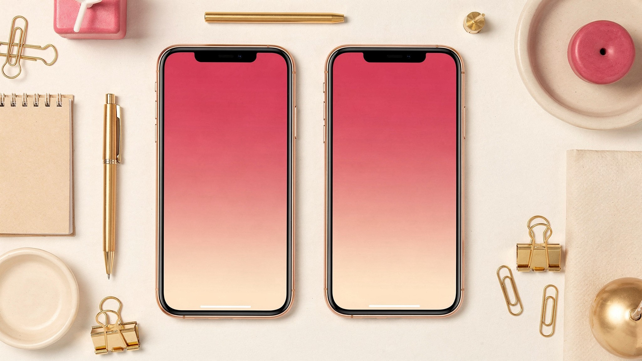
Use 1080 x 1350px (4:5 portrait) for every slide. The first slide you upload sets the aspect ratio for the whole post.
The Instagram algorithm now re-shows your carousel starting from a later slide if someone scrolled past it, so a carousel gets more than one impression from the same person.
Slide one is a hook, the middle rewards the swipe, the last slide is a clear call to action. That structure is what separates a carousel that converts from a photo dump.
Carousels average a higher engagement rate than single images and Reels for your existing audience, especially on saves and shares.
What is an Instagram carousel and why it works
A carousel is a single Instagram post that holds multiple photos or videos people swipe through. On the feed it shows as one post with little dots underneath, signaling there is more to see. It is the format formerly known as a "swipe post," and in 2026 it has become one of the most reliable ways to get reach without chasing the Reels treadmill.

The carousel post is built to be swiped, and Instagram rewards every swipe as an engagement signal.
Here is why it works. A carousel is the only format that gets a built-in second chance. In 2026, if a follower scrolls past your carousel without engaging, the algorithm can show it to that same person again later, picking up from a slide they have not seen yet. One post, multiple impressions from the same viewer. No other format does that.
On top of that, the swipe itself counts as engagement. So a carousel that holds attention across five or six slides sends Instagram five or six positive signals from a single viewer. That is why carousels tend to average a higher engagement rate than single-image posts and Reels, especially for saves and shares within an audience that already follows you.
Pro tip: Carousels are an engagement format, not a discovery format. Reels still win for reaching brand-new people, but carousels win for getting your existing followers to save, share, and act. Use both - do not pick a side. Our guide on how to get more Instagram views in 2026 covers how the two formats work together.
How to make a carousel on Instagram, step by step
Making a carousel post on Instagram is simple once you know where the button is. Here is the full process from the app.

Posting a carousel takes about a minute once you know to tap the multiple-media icon.
Posting a carousel from the Instagram app
Open Instagram and tap the plus icon. This starts a new post.
Tap the multiple-media icon. It looks like stacked squares and sits in the bottom-right of the media picker. This is the step most people miss - without it you can only post one image.
Select your slides in order. Tap each photo or video in the sequence you want them to appear. Instagram numbers them as you tap. You can select up to 20.
Edit each slide or batch-edit. You can apply a filter to one slide or to all of them, and you can trim videos individually.
Reorder if needed. Press and hold a slide to drag it into a new position before you publish. Slide one matters most, so get it right here.
Write your caption, add a location, tag accounts, then share. Your caption is part of the conversion job - more on that below.
Posting a carousel from a computer
You can also post a carousel from Instagram on the web. Click the plus icon, drag in or select your files, and the layout works the same way. Desktop posting helps if you designed your slides in a tool like Canva and want to upload full-resolution exports without moving files to your phone.
How many slides should you actually use
You can post 20 slides. You usually should not. The data points to 5 to 10 slides as the sweet spot - long enough to tell a story, short enough that people finish it. A carousel people complete sends a far stronger signal than a 20-slide post people abandon on slide four.
Pro tip: If your idea only needs three slides, post three slides. Padding a carousel to hit some imaginary minimum just gives people more chances to drop off. Slide count should follow the content, never the other way around.
The right size and aspect ratio for carousel slides
Get the sizing wrong and Instagram will crop your slides for you, usually in the worst possible place. Here is what to use in 2026.
Portrait 4:5 slides take up the most feed space, which is free real estate every time someone scrolls.
The best size for an Instagram carousel post is 1080 x 1350px, the 4:5 portrait ratio. Portrait slides take up more vertical space in the mobile feed than square ones, which means more screen, more attention, and a better shot at the swipe. Instagram also supports square (1:1) and landscape (1.91:1), but portrait is the one to default to.
Format | Dimensions | Aspect ratio | When to use |
|---|---|---|---|
Portrait | 1080 x 1350px | 4:5 | Default for almost every carousel - maximum feed space |
Square | 1080 x 1080px | 1:1 | Clean grid look, mixed photo content |
Landscape | 1080 x 566px | 1.91:1 | Rarely - only for wide imagery that demands it |
The single most important rule: all slides in a carousel must share the same aspect ratio, and the first slide you upload sets it for the whole post. If slide one is 4:5 and slide two was exported as a square, Instagram crops slide two to 4:5 anyway. Design every slide at the same size from the start.
A few more specs worth knowing. Export at 1080px wide minimum - anything smaller gets upscaled and looks blurry. Instagram accepts up to 30MB per slide but compresses on upload, so keep exports under 5MB and save JPEGs at 80 to 90 percent quality. For the full picture on every Instagram format, our complete guide to Instagram post sizes for 2026 breaks down feed posts, Stories, and Reels. To go deeper on ratios, the Instagram aspect ratio guide is the one to read.
How to design a carousel that earns the swipe
A carousel lives or dies on slide one. If the first slide does not stop the scroll, nothing else matters because nobody sees slide two. Design works backward from that fact.

Every slide should pull the eye toward the next one, so the swipe feels inevitable.
Slide one is the hook. It is the only slide that shows in the feed, so it carries the whole job of earning a swipe. Use a bold headline, a striking image, or a curiosity gap - a promise the rest of the carousel pays off. "5 mistakes killing your reach" works because people need to know if they are making them. A pretty photo with no tension does not.
The middle rewards the swipe. Each slide should give people a reason to keep going. Build a real progression: a before-and-after, a step-by-step, a story that builds. The worst carousels are ones where the slides could be in any order, because there is no reason to reach the end.
Keep every slide consistent. Same color palette, same fonts, same layout grid. When someone swipes fast, consistency is what makes the carousel read as one polished piece instead of a random pile, and it is where your brand gets recognized.
Use visual cues to pull the eye forward. An arrow, a "swipe" prompt on slide one, an image that bleeds off the right edge so it feels unfinished. Small cues, big effect on completion rate.
Mixing photos, video, and text slides
You can mix photos and video clips in the same carousel, and each video clip can run up to 60 seconds. The strongest carousels often alternate - a photo slide to catch the eye, a text slide to make the point, a short video to show it in motion. Text-only slides are fine and often the highest-performing ones in educational carousels, as long as they look intentional: big type, lots of breathing room, one idea per slide. If you run a theme page, our guide on starting an Instagram theme page in 2026 covers building a repeatable slide template.
Pro tip: The fastest way to a consistent carousel is to never reinvent the layout. Build one slide template - your fonts, colors, and margins - and drop new content into it every time. Consistency is a system, not a burst of inspiration.
The conversion psychology behind a carousel that drives action
Engagement is nice. Conversion is the point. A carousel that converts does three psychological jobs, and most creators only do the first one.

The last slide is where a swipe becomes a save, a follow, or a click - never waste it.
It opens a loop and closes it. The hook on slide one creates a small open question in someone's head. The middle slides answer it. That open-then-close loop is what makes people swipe to the end - the brain does not like leaving the question hanging. If your carousel never opens a loop, there is nothing pulling people through.
It earns the save before it asks for anything. A save is the highest-intent signal on Instagram, and people save things they expect to need later. So carousels that convert front-load genuine value: a checklist, a framework, a set of examples worth coming back to. Give people a reason to save first, and the rest of the funnel gets easier.
It ends with one clear ask. The final slide should tell people exactly what to do: "Save this for later," "Follow for more," or a prompt to check the link in bio. One ask, not five. A carousel with no closing CTA leaves all that earned attention on the table.
Your caption does conversion work too. The first line is a second hook - it shows in the feed under the post, so treat it like another slide one. Carousels also tend to attract more comments than single posts, so a caption that asks something specific gives people an easy way in.
This is where content quality compounds. A carousel that looks like a real photo shoot - consistent lighting, polished images, you in different outfits and settings - converts better than one stitched from mismatched phone photos, because it reads as more credible. That is the gap Foxy's AI twin closes. Upload a few photos, Foxy builds your AI twin, and you can generate a whole carousel of ultra-realistic AI images of yourself in any outfit or setting - same face, same person, every slide.
The best tools for building Instagram carousels
You can build a carousel in a lot of places. Here is what each tool is actually good for.

The right tool depends on whether you are designing graphic slides or shooting photo slides.
Tool | Best for | Notes |
|---|---|---|
Graphic and text-based carousel slides | Huge template library, easy brand kit, exports all slides at once | |
Polished branded graphics | Strong if you already live in the Adobe ecosystem | |
Carousels with video slides | Best for trimming and editing the video clips you mix in | |
Color-consistent photo slides | Sync one edit across every photo for a cohesive look | |
Generating the actual photo slides of yourself | Build your AI twin, generate a full carousel of consistent photos of you |
For text and graphic carousels - the educational, listicle, tips-style posts - Canva is the default and does the job well. For carousels built around photos of you, the bottleneck was never the design tool. It was getting enough good photos of yourself to fill 6 slides without doing a shoot every week.
That is the workflow Foxy changes. Instead of needing a photographer and a styled day for every carousel, you build your AI twin once from a few existing photos, then generate as many ultra-realistic photos of yourself as you want - different outfits, settings, and poses - all with your real likeness held consistent across every slide. Plans start at $29 a month, or about $14 a month on annual billing, which is less than a dollar a day. Most creators spend around $50 a month. If video slides are part of your plan, Foxy's AI video generation handles those too.
Carousel ideas that consistently perform
If you are staring at a blank canvas, these formats work across almost every niche.

Before-and-after and step-by-step carousels work because the format itself creates the reason to swipe.
Before-and-after. Slide one is the after as the hook, then walk back through how you got there. The transformation is the swipe bait.
Step-by-step or tutorial. One step per slide. Naturally rewards completion because people want the full process.
Listicle. "7 things," "5 mistakes," "10 ideas." Numbered, finite, easy to finish.
Photo dump with a point. A loose set of photos works if slide one frames why - "a week in my life," "outfits I wore this month." The frame is what makes it a post instead of a dump.
Myth versus reality. Each slide busts one assumption. Built-in tension on every slide.
Single story across slides. A panorama, a narrative, a day broken into moments.
The carousel pairs well with the rest of your Instagram strategy. Our guide on how to grow on Instagram in 2026 covers how carousels fit a full content plan, the Instagram hashtag strategy guide covers tagging them for reach, and if you are weighing carousels against video, the Reel length guide for 2026 is worth a read.
Common carousel mistakes that kill reach
Most underperforming carousels are not bad ideas. They are good ideas wrecked by a few avoidable mistakes.

Most carousel failures trace back to a weak first slide or no reason to keep swiping.
A weak slide one. If the first slide does not stop the scroll, nothing behind it matters. This is the single biggest killer.
No reason to swipe. Slides in no particular order, no progression, no open loop. People bail because there is no pull.
Mismatched aspect ratios. Slide one sets the ratio and Instagram crops the rest. Design every slide at the same size from the start.
Inconsistent design. Different fonts, colors, and layouts across slides make a carousel read as a random pile instead of one piece.
Too many slides. Padding to 15 or 20 slides just gives people more places to drop off. A finished 6-slide carousel beats an abandoned 20-slide one.
No closing CTA. You earned all that attention and then asked for nothing. Always end with one clear action.
Low-resolution exports. Anything under 1080px wide gets upscaled and looks blurry, which reads as low effort.
Mismatched photos. Slides shot in different lighting on different days look stitched together. Consistency in the imagery is what makes the whole post look credible.
That last one is the hardest to fix manually and the easiest to fix with the right tool. A carousel where every photo of you looks like it came from the same shoot - same quality, same polish - just performs better. That visual consistency is what Foxy's AI twin is built to give you, slide after slide, without booking a single shoot.
Frequently asked questions
How many photos can you put in an Instagram carousel?
Up to 20 photos or videos in a single carousel post as of 2026, up from the previous 10-slide limit. The minimum is 2. For engagement, 5 to 10 slides is the sweet spot - long enough to tell a story, short enough that people finish.
What is the best size for an Instagram carousel post?
1080 x 1350px, the 4:5 portrait ratio. Portrait slides take up the most space in the mobile feed. All slides must share the same aspect ratio, and the first slide you upload sets it for the whole post.
How do I post a carousel on Instagram?
Tap the plus icon, then tap the multiple-media icon (the stacked squares). Select your slides in the order you want them, edit, reorder by pressing and holding, then write your caption and share. You can do this from the app or from Instagram on the web.
Can you mix photos and videos in one carousel?
Yes. A single carousel can hold any mix of photos and video clips, and each video clip can be up to 60 seconds. Alternating photo, text, and video slides often performs best.
Why do carousels get more reach than single posts?
Two reasons. Every swipe counts as an engagement signal, so a multi-slide carousel sends multiple signals from one viewer. And Instagram now re-shows a carousel to people who scrolled past it, starting from a slide they have not seen - giving one post more than one impression from the same person.
Can you edit a carousel after posting?
You can edit the caption, tags, and location after posting. You cannot add, remove, or reorder slides once a carousel is published. If the slides are wrong, you have to delete and repost, so check the order before you hit share.
How many slides should a carousel have?
Use the number your content genuinely needs, usually 5 to 10. A carousel people finish sends a stronger signal than a longer one people abandon. Do not pad slide count to hit a number.
Do carousels work for every type of creator?
Yes. Fashion, fitness, beauty, lifestyle, travel, education - carousels work in every niche because the format is flexible. Before-and-afters, tutorials, listicles, and photo sets all fit the carousel structure.
What makes a carousel actually convert?
A hook on slide one that earns the swipe, a middle that rewards it with real value, and a final slide with one clear call to action. Conversion comes from opening a loop, delivering enough value to earn a save, and ending with a single ask.
How do I make my carousel slides look consistent?
Build one slide template - fixed fonts, colors, margins - and reuse it every time. For photo carousels, the challenge is getting photos of yourself that match in lighting and quality, which is where an AI twin tool like Foxy keeps your likeness and look consistent across every slide.
Related guides from the Foxy Academy
Start making carousels that convert
A carousel is one of the best-performing posts you can make on Instagram in 2026. It gets a second chance in the feed, it stacks engagement signals with every swipe, and when it is built right - hook, reward, clear ask - it turns attention into saves, follows, and clicks. The format is doing the heavy lifting. Your job is to give it slides worth swiping through.
The piece most creators get stuck on is the visuals: getting enough high-quality, consistent photos of yourself to fill a carousel without running a shoot every week. Foxy AI is the AI content tool built for exactly that. Build your AI twin in under 10 minutes from a few photos you already have, then generate as many ultra-realistic photos and videos of yourself as you want - any outfit, any setting, your real likeness held consistent across every slide. Used by over 11,000 paying creators, with plans from less than $1 a day.
Build your AI twin with Foxy - or see how Foxy makes AI content of you

Mia Torres is a content strategist who writes about platform growth and content systems for the Foxy AI Academy. She covers what's actually working on Instagram, TikTok, and YouTube for creators scaling their output.
By
Mia Torres
Content Strategist, Foxy AI Academy
Mia Torres is a content strategist who writes about platform growth and content systems for the Foxy AI Academy. She covers what's actually working on Instagram, TikTok, and YouTube for creators scaling their output.


